Autumn Swirl

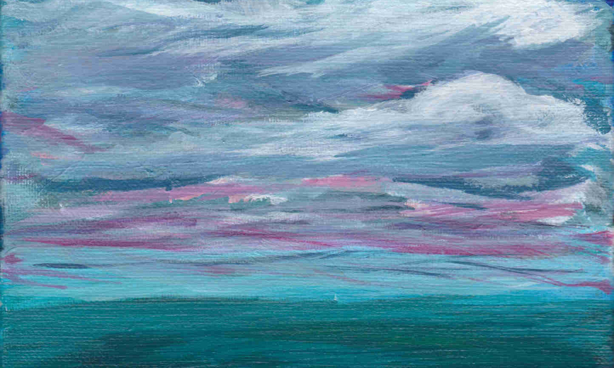
I know we’re full on into spring and looking down the barrel of another summer, but this little number here sure does feel autumnal to me. It has been a while since I’ve been inspired to get my brushes out, but I think the important thing is that its never too late to find the way back to our creative self. This little guy here is unique not only as my first digital work, but also as my first foray into this crazy new world of Non-Fungible-Tokens (NFTs). What a learning curve that is, let me tell you.

The best explanation that I’ve found so far is this: Imagine that there is a book in the town commons where you go shopping. Local ordinance elevendey-six (This number is not important, stay with me) requires that you write down any and all purchases you make into this book.

So you buy a pack of gum and you write down what you paid in the book. Then you buy a bag of decorative pebbles from a shady dealer who swears they were imported from an Ancient Royal Andalusian Quarry and are obviously local river stones, but they’re pretty and will look good in the cupholder of your car because you’ll forget them there instead of adding them to your unfinished rock garden you started out of pandemic induced boredom.

Whatever, you write that down in the book too. The point is that everyone can go look in that book and verify that you did indeed purchase all of these useless things while prancing around the town commons.

Then, your impulsive and irresponsible self goes and spends five hundred thousand dollars on a piece of digital art that is an 8-bit picture of a cat with a PopTart body pooping out a rainbow. I’m not kidding, but its too late. You’ve already written it down in the book.

Now here is the strange part. This record book – the book that everyone has already agreed chronicles the purchase history of the town square – has it written that your copy of this digital file is the one and only true original digital file.

You heard me. Your copy of this digital file is the one and only true original digital file.

If you can wrap your mind around that (and everything that it implies) then congratulations! You now understand NFTs

In other news, my store now accepts Dogecoin! To The Moon! (also bitcoin, but nobody cares about bitcoin anymore)

You can also check out the NFT of this work up for auction here

What makes good art – Part 2: Balance

The second criteria enshrined the previously discussed rubric is “Balance”. Straightforward at a glance, this intuitively simple concept reveals a hidden world of madness for those possessing enough courage to look past the surface.

Allow me to present the following argument taken from the first chapter of Rudolf Arnheim’s 1954 book “Art and Visual Perception”.
I swear I did not make this up.

First of all, Vision is a physiological process that occurs within the brain. Vision is also a psychological experience that interprets and makes sense of this physiological process.

When you observe someone throwing a ball through the air, the physiological process of vision occurs in your brain and that process is psychologically interpreted in some way that gives you an understanding that a ball is moving.

In other words, you see the ball moving because your brain tells you that the ball is moving.

Now look at this optical illusion that tricks your mind into seeing movement where no movement is actually happening.

This is the strange part.

As far as your brain is concerned, there is no observable difference between the real movement of the ball and the perceived movement in the illusion. Even though one is objectively measurable and the other doesn’t actually exist, the two events are indistinguishable as psychological events.

Therefore, according to Arnheim, we can consider that a “perceptual force” exists that causes your brain to perceive movement in the illusion, just as a real physical force exists that causes your brain to perceive movement of the ball. Just as we study the forces that act on the world, we can study the forces that act on the canvas. We can determine how they work upon our perceptual reality. We can become, in a sense, masters of our internal universe.

This is the heart of the madness – Perceptual forces bestow upon us the power to make mountains light as a breeze, to wrestle the moon, and harness the sky. The power to create anything we desire if we are bold enough to try.

Use it wisely.

Arnheim, R. (2004). Art and Visual Perception. Spain: University of California Press.

Today’s art: Brush study number three (see it being painted here)

ElementCriteriaScore (out of 5)
UnityDoes the work look good? 3
BalanceWas it used wisely? 4
MovementThe work has a sense of movement
(ie. figure positioning, flowing water, leading lines)
 3
RhythmWork has a rhythm or underlying beat that leads the viewers eye to view the artwork at a certain place 2
FocusThe viewer’s eye is drawin to a specific focal point of  the work 4
ContrastThe work is enhanced by the presence or absence of contrast 2
PatternThe work is enhanced by the presence or absence of regularly repeating lines, shapes, colors, or values 4
ProportionThe work is enhanced by the presence or absence of proportion 2
Updated 12/30/2020
Source: https://www.liveabout.com/elements-of-composition-in-art-2577514

What makes good art – Part 1: Unity

The first criteria outlined in our rubric is “Unity”, which seems as good a place as any to start my armchair philosophizing. What is this thing artists call unity? I’m so glad you asked.

Intuitively, the concept of unity in art refers to the representation of compositional elements precisely arranged within a work to achieve a composite whole whereby the sum of said compositional elements adhere to some generally recognized standard of balance, rhythm, and harmony.[1]

More simply put, good art looks good.

This very simple concept has a long and glorious history that reaches back thousands of years. Rather than chronicle the entire history of humans thinking about art, I’ll simply share interesting term I learned called organic unity. As outlined by Catherine Lord in her 1964 paper “Organic Unity Reconsidered”, this term puts forward the following three premises: “1) Subtraction or addition would diminish the value of the work of art as a whole. 2) Subtraction or addition changes the character of all the contained parts of the work of art, and 3) Every part of the work of art is not equally important when importance means prominence or impact.”[2]

She goes on to argue that the third premise supersedes the first two, and then throws out the whole sordid affair because How Dare You shackle art to one single model of “unity” in the first place![also 2]

Which is great, because now we’re right back where we started. Isn’t philosophy fun?

De gustibus non est disputandum.

Citations:
[1] Frank, Marie. “Denman Waldo Ross and the Theory of Pure Design.” American Art, vol. 22, no. 3, 2008, pp. 72–89. JSTOR, www.jstor.org/stable/10.1086/595808. Accessed 16 Dec. 2020.
[2] Lord, Catherine. “Organic Unity Reconsidered.” The Journal of Aesthetics and Art Criticism, vol. 22, no. 3, 1964, pp. 263–268. JSTOR, www.jstor.org/stable/427230. Accessed 16 Dec. 2020.

ElementCriteriaScore (out of 5)
UnityDoes it look good? 2
BalanceThe work has a symmetrical arrangement that adds a sense of calm, or an asymmetrical arrangement that creates a more dynamic feeling 3
MovementThe work has a sense of movement
(ie. figure positioning, flowing water, leading lines)
 2
RhythmWork has a rhythm or underlying beat that leads the viewers eye to view the artwork at a certain place 3
FocusThe viewer’s eye is drawin to a specific focal point of  the work 0
ContrastThe work is enhanced by the presence or absence of contrast 4
PatternThe work is enhanced by the presence or absence of regularly repeating lines, shapes, colors, or values 4
ProportionThe work is enhanced by the presence or absence of proportion 0
Created 12/13/2020
Source: https://www.liveabout.com/elements-of-composition-in-art-2577514

Stepping up a notch

Lets get serious here. I’ve been schlooping, scarping, and scumbling (one of those is actually a real thing) paint on canvas for over a month now. Some of the results aren’t terrible, but “not terrible” is a terrible standard for anyone who isn’t a college student learning how to cook a meal. If this project is going to continue, then I’ll need to figure out a way to evaluate my work according to some sort of standard.

Therefore, allow me to introduce One Grain Of Art Rubric. This is, by decree, a living document to assess any piece of art according to generally accepted principles of composition and design. As I gather sources and learn more about these principles, I will be updating the rubric accordingly. Feel free to use this rubric for your own work, and let me know if I missed anything.

Landscape number two (See it being painted):

ElementCriteriaScore (out of 5)
UnityAll parts of the work belong, nothing feels tacked on or out of place 3
BalanceThe work has a symmetrical arrangement that adds a sense of calm, or an asymmetrical arrangement that creates a more dynamic feeling 3
MovementThe work has a sense of movement
(ie. figure positioning, flowing water, leading lines)
3
RhythmWork has a rhythm or underlying beat that leads your eye to view the artwork at a certain place2
FocusThe viewer’s eye is drawn to a specific focal point of  the work 1
ContrastThe work is enhanced by the presence or absence of contrast 2
PatternThe work is enhanced by the presence or absence of regularly repeating lines, shapes, colors, or values 2
ProportionThe work is enhanced by the presence or absence of proportion 2
Source: https://www.liveabout.com/elements-of-composition-in-art-2577514

No such thing as wrong

Just because you screwed up doesn’t mean its ruined. I had intended to make a black and white landscape with a dramatic splash of red, but after failing to make a proper cloud for a half hour I decided not to do a landscape after all. Remember to find the opportunity in your failures.

Also remember to learn from your mistakes. For me this time, I learned that I need to study up on my wet on wet technique, as this was the reason my clouds didn’t come together properly.

Keep on learning!

Seascape number two

So the underpainting thing seems to be working out pretty well. One very noticeable improvement is that painting feels more like a process of laying out a general idea, then developing that idea bit by bit. Inch by inch, as they say, life is a cinch.

Which, by the way, appears to be one woefully mis-attributed idiom. According to my thirty minutes of half-assed internet research, this adage has been in print since at least the 50’s however three of my top five search results give the credit to people using it decades later. So remember kids, always verify the random things you find on random internet websites.

But back to business. I like how the layers came together in this one, and I hope you will to.

Happy painting!

Toolset revisited

I ran out of canvases. How is this possible? Just the other day I bought ten canvases! Apparently that was three weeks ago, and this is why we write things down.

Since nobody asked, I’ll list all the things I picked up during my trip to the art store.
-Ten more canvases. Just like last time, I got two five-packs of canvases. Except now I can’t find the pack of smaller canvases. Awesome. Make that five more canvases, 8″x10″.
-Another set of 10 sheets of canvas paper from Strathmore (9″x12″).
-A few more brushes because who doesn’t need more brushes? Actually, now that I think about it, I have only been using two or three of the brushes in my cup here. I use the 3/4″ wash (or the oval round) when there is lots of paint to move around, and the 1/2″ angular shader for just about everything else. Maybe the #2 round brush if there is something small that needs to happen, but mostly just those two.
1. A 3 brush set of Creative Mark “scrubber” brushes (sizes 12, 6, & 2). I vaguely remember seeing a youtube video where some non-hack talent hoarder used one to easily coax whispily delicate clouds to appear like magic. My results have been…slightly less effective.
2. A Creative Mark Beste brand 1/2″ Deerfoot brush. This brush swore to me that it was the perfect shape to make those cumulonimbus storm clouds. This brush is a liar.
3. A Creative Mark Beste brand Number 6 Filbert brush. I’m pretty sure that the word Filbert was made up by the Big Art Conglomerate to trick new artists into buying more brushes. Go ahead internet, prove me wrong.
-A 2 oz. tube of Liquitex Heavy Body Cadmium Free Red Medium. I was going to get some regular old Cadmium Red Medium, since that’s all anyone ever talks about, however the salesman at the art store mentioned that cadmium is a wee bit toxic to aquatic life, and cadmium paint needs to be soaked up in paper towels for trash disposal, not washed down the sink like my non-toxic acrylic paint. Other than that, I like this tube of paint because I have more control over how much paint comes out. I can put a small dab of paint on my palette, which isn’t possible with my student grade tubes.

In other news, I have achieved a Painting Career Milestone! Here is my first painting from a reference photograph. Enjoy!