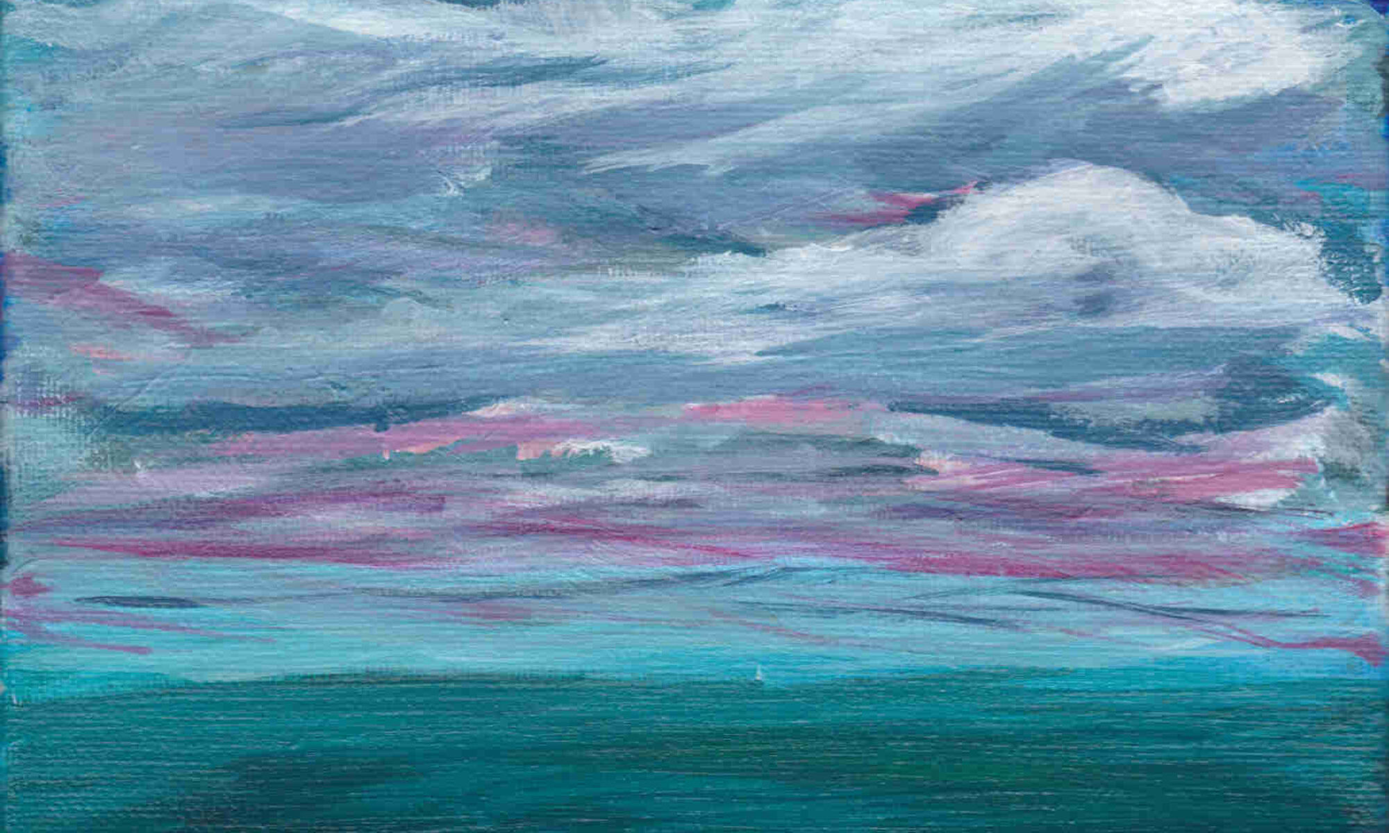
Lets get serious here. I’ve been schlooping, scarping, and scumbling (one of those is actually a real thing) paint on canvas for over a month now. Some of the results aren’t terrible, but “not terrible” is a terrible standard for anyone who isn’t a college student learning how to cook a meal. If this project is going to continue, then I’ll need to figure out a way to evaluate my work according to some sort of standard.
Therefore, allow me to introduce One Grain Of Art Rubric. This is, by decree, a living document to assess any piece of art according to generally accepted principles of composition and design. As I gather sources and learn more about these principles, I will be updating the rubric accordingly. Feel free to use this rubric for your own work, and let me know if I missed anything.
Landscape number two (See it being painted):
| Element | Criteria | Score (out of 5) |
| Unity | All parts of the work belong, nothing feels tacked on or out of place | 3 |
| Balance | The work has a symmetrical arrangement that adds a sense of calm, or an asymmetrical arrangement that creates a more dynamic feeling | 3 |
| Movement | The work has a sense of movement (ie. figure positioning, flowing water, leading lines) | 3 |
| Rhythm | Work has a rhythm or underlying beat that leads your eye to view the artwork at a certain place | 2 |
| Focus | The viewer’s eye is drawn to a specific focal point of the work | 1 |
| Contrast | The work is enhanced by the presence or absence of contrast | 2 |
| Pattern | The work is enhanced by the presence or absence of regularly repeating lines, shapes, colors, or values | 2 |
| Proportion | The work is enhanced by the presence or absence of proportion | 2 |


